Posts

Module 6- Proportional Bivariate
Image
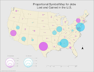
This last module dealt with proportional bivariate mapping methods. Below is a proportional map reflecting negative and positive values for the increase and decrease in the number of jobs across the U.S. We had to convert the negative values into positive values for this purpose, which allowed to symbolize is proportional to the positive values for comparison. I selected a light bright blue hue to represent the loss of jobs and a warmer purple hue to represent jobs gained. For this particular symbology need, the challenge was not so much the quantity of the values I wanted to communicate. The challenge was finding a balance and gain a better understanding of how to use color themes for that purpose. Initially, I had considered using red and blue (as in hot and cold), but it felt too political and not related to the subject matter. The main exercise for this module demanded that we create a bivariate map displaying the relationship between obesity and physical inactivity perc...

Module 5- Analytics

Image
Now that we've developed a basic comprehension of color themes, labeling, and typography. This week we dived into creating an infographic using data based on the County Health Rankings data from 2018. This is my very first attempt at an infographic, I don’t think it turned out very well. But I learned a lot overall on how to think more artistically, which is not common. I thought about color themes, placement of data, and amount of information to include and in what format (chart, text, map?). It gave me a lot of ideas on how to tackle the next infographic. Another thing I considered was visual balance by seeing how things looked like when aligned with certain ways and combinations. Given more time and tools on this assignment, I would take advantage of software such as Photoshop to include a fun background that compliments the information supplied via ArcGIS Pro.

Module 4- Color Choropleth

Image
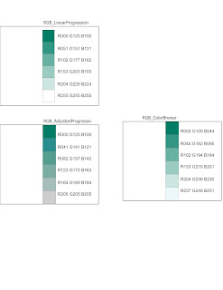
This week's module dealt with Choropleth mapping and color theory. Not being an artist, this was somewhat intense and thought-provoking. Our lab was great in walking you through the process of selecting the right color theme for a map. First, we covered some exercises in color ramp progressions. Below is an example displaying three varying gradients using the same base dark green hue. Original intervals: 51, 26, 31. In the Adjusted Progression, I reduced the previous intervals by -10 and added the values to each new set of RGB values. This appeared to make the hues above a shade darker. The adjusted progression is noticeably a shade darker in hue than both linear progression and ColorBrewer. ColorBrewer is also slightly more green, you can notice this change on the lightest color. I’m unsure what the formula used to produce those hues is, but they exhibit a bit more saturation within the hue. For the main lab exercise, we had to create a map displaying the change in the cou...

Module 3- Terrain Visualization

Image
In this week's module, we covered various terrain visualization techniques, including contour lines, hillshade manipulation, and the use of digital elevation models (DEM) on a 2-dimensional surface. The main exercise required to overlay a land cover layer of Yellowstone over an elevation raster layer. Seen below is my final result. On the left is land cover, with some transparency, over a traditional hillshade effect. I selected a traditional effect because it best represented land cover features. On the right is the elevation with a multispectral hillshade effect.  I went through a few color ramps to test which best complemented this DEM's physical features. I also went ahead and grouped many of the original land cover features into Pine Trees, Douglas Firs, etc. in order to generalize the different types of tree types. As for the map layout, at first I only had a single map frame and tested ways to represent elevation alongside land cover since I would otherwise have to mak...

Module 2- Coordinate Systems

Image
Our second module dealt with coordinate systems, their development throughout history, and why they matter. I really enjoyed reading through this module's discussion since our discussion leaders selected unique coordinate systems to analyze. Antarctica's preferred coordinate system was interesting to consider since it's such a unique location. We are used to seeing maps in Mercator projection, which distorts all landforms to form a flat frame. It great learning more about how that projection works. Canada in the Lambert Conformal Conic projection For the lab, we went through a series of different minor exercises to view and apply various coordinate systems and projections in ArcPro in order to grasp a better understanding of each distortion and best uses. Lastly, the main exercise had us apply a ‘graticule’ in geographic coordinates and a measured grid in projected coordinates for a state in the U.S. I selected the state of Colorado as it’s one of my favorite st...

Module 1- Map Design & Typography

Image
This first module served as a great refresher for key concepts in map design and typography. Admittedly, in day to day practice, I use ArcMap 99% of the time. Using ArcPro instead for this course has definitely been a welcome crash course on any and all updates to many familiar tools and features. The lab required to go through the process of compiling a simple map of Travis County, Texas, without labels for now, and develop a comprehensive understanding of what goes behind our own reasoning for certain design choices. In retrospect, I think there's a better way to symbolize Golf Course areas as they're not very prominent in the final map below. I would also modify the major roads symbology to be slightly thinner, and provide a faded drop shadow effect to the county shape so it does no feel flat.

GIS5100 Week10: Final Project

Image
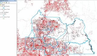
My final project was dedicated to finding suitable areas for a new Elementary School site in Riverside County, California. I started out by compiling 5 pieces of key datasets: County Assessor parcel data, California Schools, Fault zones, Roads, and Public sites. First I performed euclidean distance analyses on four of them in order to produce zonal raster for preferred areas. A weighted analysis based on prioritizing safety shows that ideal areas fall within Hemet, Menifee, and Palm Springs Unified School Districts. Final analysis results show how active school sites are distributed, where all vacant parcels of at least 5 Acres or more lie, and recommended areas for a new school site. The two circled were determined to be the most suitable after analyzing results from weighted overlay analyses and locations of parcels. Additional setbacks are anticipated as more conditions are implemented to the list of mandatory criteria needed to finalize parcels. Looking b...

GIS5100 Week9: Planning-- GIS for Local Government

Image
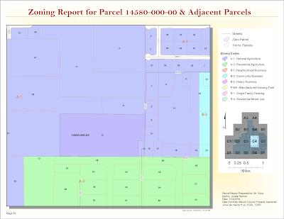
For this last module, we were given a parcel number to create a parcel report for a specific site in Marion County, Florida and its adjacent parcels. I prepared a map book using Data Driven Pages for this request using parcel data driven pages in PDF format. The map below is one page from it which displays the parcel in question. I learned all about creating and editing a parcel report to deliver to the fictional client in this scenario, Mr. Zuko. The map book feature in ArcGIS is a fantastic tool, I learned. The zoning report above was completed using data directly from the Marion County property appraiser's site and Marion County's  Land Development Code site . Part two of this lab required to identify suitable parcels for Gulf County's Board of County Commissioners (BOCC) new extension office. It required learning some advanced parcel editing methods such as creating a custom parcel based on the following client specifications: Begin at the Northeast Corner ...

GIS5100 Week 8-9: Planning-- Participation Activity

Image
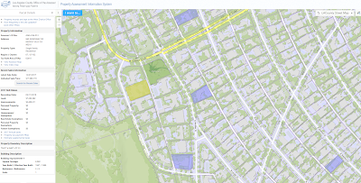
As part of our section in Planning, we completed this additional exercise in learning where to search for local parcel data in our city and what type of information is necessary to conduct a parcel report. There are a few property appraisers in Los Angeles County, it seems. This one offered some free map data services  here . While did not provide a filter to narrow down highest priced properties by year. I did find a property that sold for 17 million last year in the Beverly Hills area. The current assessed land value is $7,263,892. No previous sale price is included in this assessment. While there's limited information about recently sold properties, there is an assessor's map for this property  here . It was interesting to learn that the County updates Parcel data on this site once a year in late July once the Assessor’s Roll Release is complete. This site is fairly limited, all things said. For example, I am unable to view much data about other nearby parcels ...

GIS5100 Week8: Planning-- Location Decisions

Image
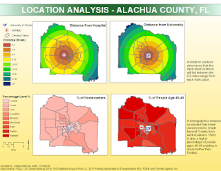
This week we were introduced to urban planning. The lab assignment required 2 location analysis maps in order to help a professional couple find suitable suggestions on where to live in Alachua County, Florida. This hypothetical couple consists of a cardiologist that works at the North Florida Regional Medical Center, and a professor looking to work at the University of Florida. Their priorities are as follows: Close to the NF RMC Close to University of Florida A neighborhood with high percentage of people ages 40-49 A neighborhood with high property values I was able to perform a location analysis for all 4 desired criteria in the map below. This analysis determined that the most ideal areas will fall between 0-9 miles from their work places. A second analysis was done doing weighted overlays based on criteria importance. The first map on the left shows an overlay in which all 4 criteria have 25% weight. The second on the right favors distances from work with an 80...

GIS5100 Week7: Homeland Security-- Protect Critical Infrastructure

Image
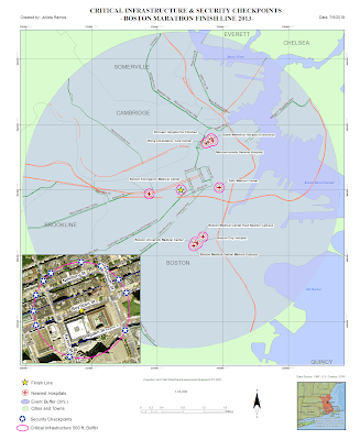
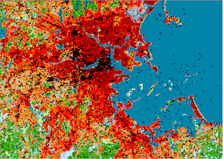
This lab marks the last week for Home Land Security. Last week we were introduced to an organizational standard for a HLS Geodatabase consisting of 7 group layers covering essential data sets in a HLS scenario for the Boston Marathon bombing in 2013. This week we put those data sets to use to produce a scenario map for critical infrastructure and a second map for site surveillance locations around critical infrastructure. This first map contains information which local towns/cities, and buildings are located within 3 mile radius from the Finish Line. Using Census data, I was able to narrow down a list of nearest hospitals, the closest one being Boston Emergency Medical Center. There were a total of 49 hospitals, 2 dams, 7 airports, and 213 schools-- all of these are considered critical infrastructures. Using Road CFCC code data, I then identified ingress and egress routes within 500 ft. from the Finish Line. These routes would be used to closely monitor suspicious activity as people...

GIS5100 Week6: Homeland Security--Prepare Minimum Essential Data Sets

Image
This week we were introduced to MEDS, which stands for Minimum Essential Data Sets. It is a series of minimal essential data sets are critical to the success of a HLS operation.   It consists of the following 8 minimal data sets: Ortho imagery Elevation Hydrography Transportation Boundaries Structures Land cover Geographic Names Due to the data used being critical to safety operations, there are minimal goals for resolution, accuracy, and currency in place for both Urban and Large areas.  For our lab this week, I prepared a MEDS GIS that helps identify key data sets to prepare for a Boston Marathon bombing crisis scenario. Started by organizing a new map based on a Boston Geodatabase. Then created 7 different group layers to include ortho imagery, DEMs, geographic names, transportation, hydrology, boundaries, structures, and land cover data. Given a specific study area helped identify only the Boston Counties affected along with geographic sites...

GIS5100 Week5: Homeland Security-- D.C. Crime

Image
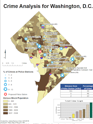
This week we start look at how GIS is used for solving homeland security and law enforcement decisions. This first assignment focuses on how crime is analyzed and managed using GIS by performing a crime analysis for Washington D.C. using data from the DC Metropolitan Police Department . For the first map deliverable, I Geocoded Police Stations from table data in order to create a point shape file for a Police Stations layer. Using a Distance Buffer and Spatial Join for Crime proximity, I was able to determine that higher populated areas do not necessarily mean higher crime rate. However, for some reason, there’s more crimes committed closer to Police stations. A majority of crime tends to occur within 1 mile of Police Stations according to the pattern displayed. Police stations are displayed by percentage of crime activity. The Police Stations with the highest crime percentages are Sixth District (6D), Seventh District (7D), and Third District (3D). 6D observes a lot of theft type ...

GIS5100 Week4: Natural Hazards-- Hurricanes

Image
This week's assignment closes our section in natural hazards with Hurricane Sandy. Using data from NOAA, FEMA, and state of New Jersey I was able to first map Hurricane Sandy's path then take a closer look at the damage caused in Ocean County, NJ. The map below was created using table data detailing storm information to create a storm path, which was them symbolized to display how it changed from start to end. I also performed a Storm Damage Assessment using NOAA, FEMA, and state of New Jersey data. The most important step for this assessment was putting together two raster mosaics, one pre-storm and one post-storm, of aerial imagery for the study area. I was able to create a chart of damage done to one side of Fort Ave using the two mosaics and ArcGIS's Effects tool.

GIS5100 Week3: Natural Hazards-- Tsunamis

Image
This week's lab had us create an evacuation map for the tsunami in Fukushima, Japan. Part of it also served as refresher in best practices for setting up a new Geodatabase using only base data files. Which meant I had to organize different feature classes into feature datasets to improve productivity. There is a lot of data involved for a natural disaster scenario and it drove home the importance of maintaining specific feature datasets within the geodatabase. One of my favorite steps in this lab involved the Fukushima and Sendai area DEMs that helped generate Evacuation Zones 1-3, not pictured in the final map in order to create a final affected coastal zone DEM. I had never created a model as large as the one for this step in model builder, it certainly saved a lot of time. What I've taken away from this scenario is that whichever method of risk assessment is used, the GIS specialist has to be prepared with the data organized and ready to present during an emergency in o...

GIS5100 Week2: Natural Hazards-- Lahars

Image
For our first lab of this course we had to identify potential hazard zones for the Mt. Hood area in Oregon.  I was able to create a final stream feature using tools in the  Spatial Analyst Extension in ArcGIS, a 2011 USGS 30M DEM of the region, census block group data, and hydrology data. To do this, I had to convert a number of rasters using the original hydrology data and DEM to determine a flow. Then, using the census block data, I was able to determine which block groups were in hazardous areas based on whether they intersected the hazard stream at .5 a mile buffer. The final result is a population analysis for areas within hazard zones. As one can see, there is a strong concentration of people, cities, and schools Southwest of Mt. Hood.

GIS Portfolio

After completing this GIS Internship course, I'll have one more course in order to complete my certification this summer. It's a great time to setup a portfolio to best showcase what I've learned and accomplished during this program and hopefully receive feedback from peers. It was a very daunting assignment when starting out. It required going back through my student blog to review which assignments I felt strongly about the most. I wound up testing different formats, menu order, and ways to implement numerous map assignments. Alas, my current final GIS portfolio can be found at  http://julieta-gis.net/ I decided to go with the digital option due to the amount of content and also because I wanted a chance to refresh my website making and modifying skills. A great benefit to using a site is that you can continue to add any sort of content in your portfolio section. This turned out to be a great assignment. Whether a peer made a paper or digital portfolio, this is some...

GIS5935 Module 15-- Dasymetric Mapping

Image
For this last module, we explored methods in Dasymetric Mapping. Dasymetric Mapping is "the process of disaggregating spatial data into finer units of analysis using ancillary data to help refine locations of population of another phenomena." This type of analysis basically helps look at where populations of a certain demographic(s) are concentrated within a set of boundaries. It may sounds like a fairly straight forward process, but it turned out more complex than expected... The first two parts of the lab were great exercises and stepping stones, per se, in introducing us to the process and mind set of actually perform a dasymetric analysis. First I performed an Areal Weighting analysis that required to produce a population estimate for areas within a Basin. This was followed by another Areal Weighting exercise this time with ancillary data which produced a population estimate for children within certain school districts. I will admit that the last part got the be...

GIS5935 Module 14-- Aggregation

This week's lab focuses on becoming familiar with the Modifiable Area Unit Problem (MAUP) and its two effects: scale and zonation. Mainly, I learned more about how people try to manage Gerrymandering. Gerrymandering is one of the best examples of the Zonation effect in the MAUP. This involves the splitting of Counties, usually unevenly, as means to exclude certain demographics to gain favor for a political party. A possible way to measure the effect it has on political districts would be to calculate how many Counties a District breaks up. Ideally, we want to lessen the amount of Counties broken up in this process. Depending on the County population, a standard measure can be established in order to even out Districts.

GIS5935 Module 13-- Effects of Scale

Image
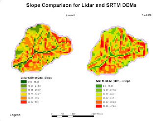
This was the first week addressing the topic of scale. The lab objective was to observe the effects of scale and resolution in spatial data properties for vector and raster data. First part of the lab required me to analyze differences in scale for hydrology features. Second, I had to compare two digital elevation models (DEMs), Lidar and SRTM, and figure out a method for comparing elevation data. I performed Slope, Aspect and Curvature analysis on the Lidar DEM at a resolution of 90m. Then performed Slope, Aspect, and Curvature analysis on the reprojected SRTM DEM also at 90m. This data allowed me to produce a chart listing averages for both DEMs in order to observe any trends. Notable inconsistencies were found in Average Slope degrees and Max elevation between the two DEMs. SRTM DEM had a lower measure at 29.4 average slope degrees, while the Lidar DEM was 31.3. Maximum elevation was higher for the Lidar DEM at 1063.05 than the SRTM DEM at 1053. DEM DEM resolution (mete...