Posts

Showing posts with the label GIS3015- Cartographic Skills

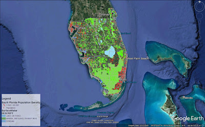
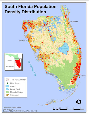
Cartographic Skills: Final Project

Image
For the final project we were given two different scenarios to chose from: Option 1- Display mean SAT scores and test participation rates for 2014 college bound seniors. Option 2- Create your own project scenario. I went with Option 2 to see how it would go. My scenario of choice focuses on observing the correlation between amount of crops harvested in the state of California for the year 2012 and the distribution of different Farmland types as defined by the Farmland Mapping & Monitoring Program (FMMP). Methods Used: First thing to do was search for the necessary data sets: information on crop yields and data on farmland for California. USDA site was extremely helpful as was the California Department of Conservation website. NOAA was very helpful in providing national weather reports, maps, and graphs to see firsthand record of gradual change in different regions. Next, was looking for a California counties shape file, which was found through ESRI and the U.S. Ce...

Module 12- NeoCartography

Image
As we get closer to the end of this course it is fitting that we focus on modern trends in Cartography and where it's headed. Concepts covered this week are: the concept of Volunteered Geographic Information, Public Participation GIS, Geocollaboration, Geotargetting, Cloud Computing and Cloud Based GIS. This week's lab consisted of two parts: Create a shareable web map utilizing the data created in Module 10- Dot Density Mapping. Create an interactive Google Earth tour (fun!) Objectives here being to use our data from Module 10 Dot Density map lab to present in Google Earth and to create a Google Earth Tour of major cities in South Florida. Below is a screenshot captured in Google Earth of my South Florida Population Density map. This was done by first stripping down the original map in ArcMap and using the Map to KML and Layer to KML tools to convert my files from .mxd to .kmz file type. This allowed them to be opened in Google Earth. The second part to this w...

Module 11- 3D Mapping

Image
This week's lab consisted of three parts to cover 3D Mapping: ESRI Training course: 4D Visualization Techniques Using ArcGIS Converting 2D data to 3D 3D Concepts Continued: City Engine and Minard's map of Napoleon's Russian Campaign of 1812. Part one was lengthy but very fun, I thought. Using ArcGIS, ArcScene, and Google Earth, we were tasked with learning techniques to visualize feature data in 3D such as buildings, wells, streams, towers, and vegetation. It was really neat seeing how basic data came together to visualize an environment in 3D. Techniques covered in these exercises included: setting base heights for raster and feature data, setting vertical exaggeration, setting illumination, extruding buildings and wells, and extruding parcel values. Everything learned in part one were essential in part two. We were given a set of 2D data and converted it to 3D then implemented it in Google Earth. Part three was interesting to think critically abou...

Module 10- Dot Mapping

Image
This week we covered Dot density mapping. Our assignment being to make a dot density map using tabular Census data, ArcMap, and Illustrator to finalize. The job entailed presenting population data for South Florida counties. I did this by joining the tabular Census data to the South Florida county shape file provided and creating a new shape file out of it containing all the data necessary for this. We were also provided with an Urban Land and Surface Water shape file. I noticed there were 3 major attributes within surface water data: streams, wetlands, and lakes. They're not the same physical feature, so they were separated in order to uniquely represent each feature. Urban Land was the key feature for this assignment as it allowed to only display population density in urban areas.

Module 9- Flowline Mapping

Image
This week we focused on Flowline Mapping. Using a base map from ESRI created in ArcMap, we were required to only use Adobe Illustrator to create a distributive flow map showing immigration to the U.S. Two data sets are displayed here: the number of immigrants per continent in 2007 and a choropleth map of the U.S. displaying the percentage of immigrants for each state. The first data set uses flow lines of proportional width calculated using the number of immigrants. This immigration data was derived form the 2007 Yearbook of Immigration Statistics created by the U.S. Department of Homeland Security's Office of Immigration Statistics. I chose to work with FlowBaseMapB, which meant moving some continents right away. After relocating to have North America in the middle, because this map is about immigration to the U.S.. I modified colors for all continents and added a drop shadow effect. I also stylized the background with a flat grain effect so it wouldn’t be plain yet sti...

Module 8- Isarithmic Mapping

Image
This week we focused on Isarithmic mapping. We were tasked to create three maps showing isarithmic symbolization methods of precipitation data for the state of Washington. The data set used came from the PRISM Group in Oregon State University and was compiled using what is called the PRISM (Parameter-elevation Relationships on Independent Slopes Model) interpolation method. Using the spatial climate data set of 1981-2010 average annual precipitation for the state of Washington in ArcMap, I visualized three different isarithmic symbolization methods: Continuous tones, Hypsometric tints, and Hypsometric tints with contour lines(final map). It was interesting going through significant elements of data, both in the required reading and lab, necessary to arrive to a type of map anyone who has looked at a weather map has seen. Most interesting though was learning how measurements for weather phenomena are recorded. Below is the result from this exercise, which was visually finalized in...

Module 7- Choropleth and Proportional Symbol Mapping

Image
For this lab exercise, I created a choropleth map showing the population densities in European countries and wine consumption portrayed by proportional symbols. The majority of the map was completed using ArcMap and Illustrator was used to adjust labeling and finalize the layout. This week we focused on Choropleth mapping. This meant that we got a deeper look into how distribution data is calculated and becomes different symbol sizes, and how to select a set of color hues. To represent population density, I went with a light- dark orange scheme compiled using ColorBrewer. We’re displaying population density, using this ranged color scheme seemed appropriate to symbolize density of an area whether the reader suffers from color blindness or not. For wine consumption symbology, I chose to go with the Graduated symbols method because the size of the symbols are directly attributed to the values they are representing. The data in question being wine consumption amounts, which is quant...

Module 6- Data Classification

Image
This week we explored different data classification methods and basic procedures to classify data. We were provided with data from the U.S. Census Bureau 2010 Census Tracts for the state of Florida, in Miami Dade County. With this data from the FGDL , we were tasked with classifying it based on percentage of population above 65 years of age and population above 65 years per square mile. For the lab, we had to apply the provided Census data to four different classification methods: Equal Interval, Quantile, Standard Deviation, and Natural Breaks. Below is 1 of 2 maps required for this assignment. This map focuses on displaying the senior population distribution in Miami Dade County, FL by percentage over 65. Each method used 5 classes and data was rounded to two decimal places. Due to color hues playing a significant visual part in this exercise, I decided to remove the borders from each class to better display the distributions.

Module 5- Spatial Statistics

Image
This lab required to complete the Explore Spatial Patterns in Your Data Using ArcGIS  web course via ESRI training. It consists 5 exercises in order to determine which areas in western and central Europe should issue a freeze advisory based on the current readings provided by weather monitoring stations across the region. Ex. 1- Explored the spatial distribution of data: I learned how to calculate the mean center, median center, and examine directional trends of a spatial data set. Ex. 2- Explored the values of the data: this consisted of learning how to interpret data from a Histogram and Normal QQ plot in order to determined that the data set consists of characteristics of normal distribution. Ex. 3- Explored spatial relationships on data: here I used a Voronoi map to identify outlier data points. Ex. 4- Validated spatial autocorrelation using a Semivariogram to determined that there is an outlier in the data set by analyzing the data points in 3d space as means...

Module 4- Cartographic Design

Image
This week we continue our saga in learning and applying key cartographic design principles. Last week was a crash course in typography, so this week we focused on map design. The task at hand was to create a map of public schools in Ward 7, Washington D.C. while complying with Gestalt's Principles of Visual Hierarchy, Contrast, Figure-ground, and Balance. Not having any graphic arts training before, I can assure you there was plenty time spent testing out colors... Before launching ArcMap, I made a list of visual features from most to least important. Ward 7 and schools should be the key highlight of this task. With that in mind, color choices were next as well as deciding what features to exclude. It was clear that Ward 7 should contain the most information. I applied contrast by means of color vibrancy. The area for Ward 7 is the brightest while the colors for the rest of Washington D.C. and surrounding states are dull in comparison. I think the use of a dull pastel green helps...

Module 3- Typography

Image
In this lab we learned some basics in typography and how to apply typographic principles when crafting our maps. The main objective in this exercise was to properly label Marathon, Florida and its surrounding islands. To begin, I created a basic map of Marathon, FL in ArcMap. The only elements added were the inset map of the state of Florida, major roads, Marathon and surrounding islands as the main feature, a north arrow, scale bar, date, cartographer, and data sources. The hard work came in after exporting it to touch it up in Illustrator. All labels, symbols, effects, and legend were done in Illustrator. At first, it appeared like a simple enough exercise to label a few islands off Florida. But a lot of thought went into how to label all of these items in trying to follow guidelines outlined in the reading. Before starting to label items, I broke down the number of fonts needed, tiers of a site's importance which would determine the font size used, and type colors. A few ...

Module 2- Introduction to Adobe Illustrator

Image
This week we explored utilizing both ArcMap and Adobe Illustrator to create and enhance a basic map of Florida for a children's encyclopedia. I wound up spending a lot more time on this assignment than expected since it was my first time enhancing a map from ArcMap. Layers needed some readjusting before I felt comfortable adding graphics. Color scheme wise, I decided to keep it light and simple, it's for kids after all. That dictated the choice of font and border style used as well as the title. There were a lot of images in this map that could drown out the title. So I figured it was best to make a banner for it to stand out. This is actually the second map because while working through the lab document the first time, I realized that my initial Florida map layout did not suit the layout I worked towards in AI. When I was ready to work on a finalized version, knowing the audience and content required drove the layout.

Module 1- Map Evaluation & Critique

Image
In this introductory cartography lab, we reviewed some basic aesthetics of what makes a good map and common map design principles. The exercise at hand required that we select two maps of our choice, one which we think is well designed and one poorly designed. Evaluation of a poorly designed map: This selection had to serve as example of nearly everything to avoid when creating a decent informative map. As more of a visual learner, busy displays can be very disruptive and intimidating. I've seen language and dialect maps before and they can very aesthetically pleasing to the eye and inviting to process their information. I would give this map a D letter grade for effort and information alone. My main reasons for a low grade are highly due to the lack to effectively label the map, the general layout is more complex than it needed to be, and it fails to be graphically pleasing. Three areas of improvement I would suggest working on are: layout, labels, and color theme. The t...

Cartographic Skills- Introduction

Hi! My name is Julieta Ramos and I’m from Los Angeles, California. I hold a B.A. in Anthropology from the University of California Riverside. During undergrad years, I completed an archaeology field school in Belize, and interned for LULAC in Washington D.C.. Afterwards, I volunteered for the World Wide Organization of Organic Farmers (WWOOF) for 3 months in France and Italy. From there, I worked in CRM and tutored for a few years before falling backwards into the game industry in which I’ve worked my way up from a tester to project and localization manager for a video game studio in town. Having worked in software development for the past 6 years helped steer me back to this field since it continues to play a major role in geographical intelligence and advancements. Earth is ever changing and I see this industry growing fast. I figured this is the right time in my life to invest in a dream career path. Upon discovering GIS during undergrad, I've kept meaning to return to work in...