Posts

Showing posts from March, 2017

Module 10- Dot Mapping

Image
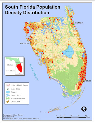
This week we covered Dot density mapping. Our assignment being to make a dot density map using tabular Census data, ArcMap, and Illustrator to finalize. The job entailed presenting population data for South Florida counties. I did this by joining the tabular Census data to the South Florida county shape file provided and creating a new shape file out of it containing all the data necessary for this. We were also provided with an Urban Land and Surface Water shape file. I noticed there were 3 major attributes within surface water data: streams, wetlands, and lakes. They're not the same physical feature, so they were separated in order to uniquely represent each feature. Urban Land was the key feature for this assignment as it allowed to only display population density in urban areas.

Module 9- Flowline Mapping

Image
This week we focused on Flowline Mapping. Using a base map from ESRI created in ArcMap, we were required to only use Adobe Illustrator to create a distributive flow map showing immigration to the U.S. Two data sets are displayed here: the number of immigrants per continent in 2007 and a choropleth map of the U.S. displaying the percentage of immigrants for each state. The first data set uses flow lines of proportional width calculated using the number of immigrants. This immigration data was derived form the 2007 Yearbook of Immigration Statistics created by the U.S. Department of Homeland Security's Office of Immigration Statistics. I chose to work with FlowBaseMapB, which meant moving some continents right away. After relocating to have North America in the middle, because this map is about immigration to the U.S.. I modified colors for all continents and added a drop shadow effect. I also stylized the background with a flat grain effect so it wouldn’t be plain yet sti

Module 8- Isarithmic Mapping

Image
This week we focused on Isarithmic mapping. We were tasked to create three maps showing isarithmic symbolization methods of precipitation data for the state of Washington. The data set used came from the PRISM Group in Oregon State University and was compiled using what is called the PRISM (Parameter-elevation Relationships on Independent Slopes Model) interpolation method. Using the spatial climate data set of 1981-2010 average annual precipitation for the state of Washington in ArcMap, I visualized three different isarithmic symbolization methods: Continuous tones, Hypsometric tints, and Hypsometric tints with contour lines(final map). It was interesting going through significant elements of data, both in the required reading and lab, necessary to arrive to a type of map anyone who has looked at a weather map has seen. Most interesting though was learning how measurements for weather phenomena are recorded. Below is the result from this exercise, which was visually finalized in

Module 7- Choropleth and Proportional Symbol Mapping

Image
For this lab exercise, I created a choropleth map showing the population densities in European countries and wine consumption portrayed by proportional symbols. The majority of the map was completed using ArcMap and Illustrator was used to adjust labeling and finalize the layout. This week we focused on Choropleth mapping. This meant that we got a deeper look into how distribution data is calculated and becomes different symbol sizes, and how to select a set of color hues. To represent population density, I went with a light- dark orange scheme compiled using ColorBrewer. We’re displaying population density, using this ranged color scheme seemed appropriate to symbolize density of an area whether the reader suffers from color blindness or not. For wine consumption symbology, I chose to go with the Graduated symbols method because the size of the symbols are directly attributed to the values they are representing. The data in question being wine consumption amounts, which is quantitat