Module 7- Choropleth and Proportional Symbol Mapping
For this lab exercise, I created a choropleth map showing the population densities in European countries and wine consumption portrayed by proportional symbols. The majority of the map was completed using ArcMap and Illustrator was used to adjust labeling and finalize the layout.
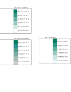
This week we focused on Choropleth mapping. This meant that we got a deeper look into how distribution data is calculated and becomes different symbol sizes, and how to select a set of color hues. To represent population density, I went with a light- dark orange scheme compiled using ColorBrewer. We’re displaying population density, using this ranged color scheme seemed appropriate to symbolize density of an area whether the reader suffers from color blindness or not. For wine consumption symbology, I chose to go with the Graduated symbols method because the size of the symbols are directly attributed to the values they are representing. The data in question being wine consumption amounts, which is quantitative information. Instead of going with a standard of 5 classes, I chose 3 in order to lower the chance of a reader perceiving circle sizes wrong. This way it’s just small>medium>large circles different enough in size to easily read (hopefully).

This week we focused on Choropleth mapping. This meant that we got a deeper look into how distribution data is calculated and becomes different symbol sizes, and how to select a set of color hues. To represent population density, I went with a light- dark orange scheme compiled using ColorBrewer. We’re displaying population density, using this ranged color scheme seemed appropriate to symbolize density of an area whether the reader suffers from color blindness or not. For wine consumption symbology, I chose to go with the Graduated symbols method because the size of the symbols are directly attributed to the values they are representing. The data in question being wine consumption amounts, which is quantitative information. Instead of going with a standard of 5 classes, I chose 3 in order to lower the chance of a reader perceiving circle sizes wrong. This way it’s just small>medium>large circles different enough in size to easily read (hopefully).


Comments
Post a Comment