Module 5- Analytics
Now that we've developed a basic comprehension of color themes, labeling, and typography. This week we dived into creating an infographic using data based on the County Health Rankings data from 2018.
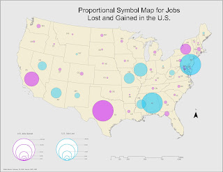
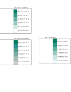
This is my very first attempt at an infographic, I don’t think it turned out very well. But I learned a lot overall on how to think more artistically, which is not common. I thought about color themes, placement of data, and amount of information to include and in what format (chart, text, map?). It gave me a lot of ideas on how to tackle the next infographic. Another thing I considered was visual balance by seeing how things looked like when aligned with certain ways and combinations. Given more time and tools on this assignment, I would take advantage of software such as Photoshop to include a fun background that compliments the information supplied via ArcGIS Pro.

This is my very first attempt at an infographic, I don’t think it turned out very well. But I learned a lot overall on how to think more artistically, which is not common. I thought about color themes, placement of data, and amount of information to include and in what format (chart, text, map?). It gave me a lot of ideas on how to tackle the next infographic. Another thing I considered was visual balance by seeing how things looked like when aligned with certain ways and combinations. Given more time and tools on this assignment, I would take advantage of software such as Photoshop to include a fun background that compliments the information supplied via ArcGIS Pro.

Comments
Post a Comment