Module 6- Proportional Bivariate
This last module dealt with proportional bivariate mapping methods.
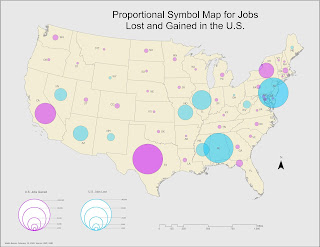
Below is a proportional map reflecting negative and positive values for the increase and decrease in the number of jobs across the U.S. We had to convert the negative values into positive values for this purpose, which allowed to symbolize is proportional to the positive values for comparison. I selected a light bright blue hue to represent the loss of jobs and a warmer purple hue to represent jobs gained. For this particular symbology need, the challenge was not so much the quantity of the values I wanted to communicate. The challenge was finding a balance and gain a better understanding of how to use color themes for that purpose. Initially, I had considered using red and blue (as in hot and cold), but it felt too political and not related to the subject matter.
The main exercise for this module demanded that we create a bivariate map displaying the relationship between obesity and physical inactivity percentages across the nation. Preparing the data for this was likely the most important step throughout the process since it involved some data calculations. What I prepared were values for 2 new fields (CLASS_OBESITY and CLASS_INACTIVITY) by gathering class values from a 3-class Quantile classification for Percent_Obese and Percent_PhysicalInactivity fields. Once those values were determined, I assigned them classes that would allow me to concatenate those two new fields in order to populate a third and final new field: CLASS_FINAL. The data in this final field is what is displayed in the bivariate map below.

Below is a proportional map reflecting negative and positive values for the increase and decrease in the number of jobs across the U.S. We had to convert the negative values into positive values for this purpose, which allowed to symbolize is proportional to the positive values for comparison. I selected a light bright blue hue to represent the loss of jobs and a warmer purple hue to represent jobs gained. For this particular symbology need, the challenge was not so much the quantity of the values I wanted to communicate. The challenge was finding a balance and gain a better understanding of how to use color themes for that purpose. Initially, I had considered using red and blue (as in hot and cold), but it felt too political and not related to the subject matter.

The main exercise for this module demanded that we create a bivariate map displaying the relationship between obesity and physical inactivity percentages across the nation. Preparing the data for this was likely the most important step throughout the process since it involved some data calculations. What I prepared were values for 2 new fields (CLASS_OBESITY and CLASS_INACTIVITY) by gathering class values from a 3-class Quantile classification for Percent_Obese and Percent_PhysicalInactivity fields. Once those values were determined, I assigned them classes that would allow me to concatenate those two new fields in order to populate a third and final new field: CLASS_FINAL. The data in this final field is what is displayed in the bivariate map below.


Comments
Post a Comment