Posts

Showing posts from February, 2020

Module 6- Proportional Bivariate

Image
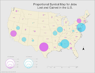
This last module dealt with proportional bivariate mapping methods. Below is a proportional map reflecting negative and positive values for the increase and decrease in the number of jobs across the U.S. We had to convert the negative values into positive values for this purpose, which allowed to symbolize is proportional to the positive values for comparison. I selected a light bright blue hue to represent the loss of jobs and a warmer purple hue to represent jobs gained. For this particular symbology need, the challenge was not so much the quantity of the values I wanted to communicate. The challenge was finding a balance and gain a better understanding of how to use color themes for that purpose. Initially, I had considered using red and blue (as in hot and cold), but it felt too political and not related to the subject matter. The main exercise for this module demanded that we create a bivariate map displaying the relationship between obesity and physical inactivity perc

Module 5- Analytics

Image
Now that we've developed a basic comprehension of color themes, labeling, and typography. This week we dived into creating an infographic using data based on the County Health Rankings data from 2018. This is my very first attempt at an infographic, I don’t think it turned out very well. But I learned a lot overall on how to think more artistically, which is not common. I thought about color themes, placement of data, and amount of information to include and in what format (chart, text, map?). It gave me a lot of ideas on how to tackle the next infographic. Another thing I considered was visual balance by seeing how things looked like when aligned with certain ways and combinations. Given more time and tools on this assignment, I would take advantage of software such as Photoshop to include a fun background that compliments the information supplied via ArcGIS Pro.

Module 4- Color Choropleth

Image
This week's module dealt with Choropleth mapping and color theory. Not being an artist, this was somewhat intense and thought-provoking. Our lab was great in walking you through the process of selecting the right color theme for a map. First, we covered some exercises in color ramp progressions. Below is an example displaying three varying gradients using the same base dark green hue. Original intervals: 51, 26, 31. In the Adjusted Progression, I reduced the previous intervals by -10 and added the values to each new set of RGB values. This appeared to make the hues above a shade darker. The adjusted progression is noticeably a shade darker in hue than both linear progression and ColorBrewer. ColorBrewer is also slightly more green, you can notice this change on the lightest color. I’m unsure what the formula used to produce those hues is, but they exhibit a bit more saturation within the hue. For the main lab exercise, we had to create a map displaying the change in the cou