Module 9- Flowline Mapping
This week we focused on Flowline Mapping. Using a base map from ESRI created in ArcMap, we were required to only use Adobe Illustrator to create a distributive flow map showing immigration to the U.S. Two data sets are displayed here: the number of immigrants per continent in 2007 and a choropleth map of the U.S. displaying the percentage of immigrants for each state. The first data set uses flow lines of proportional width calculated using the number of immigrants. This immigration data was derived form the 2007 Yearbook of Immigration Statistics created by the U.S. Department of Homeland Security's Office of Immigration Statistics.
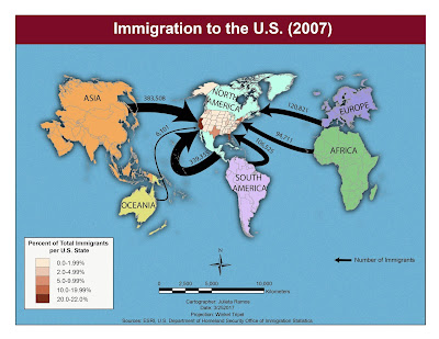

I chose to work with FlowBaseMapB, which meant moving some continents right away. After relocating to have North America in the middle, because this map is about immigration to the U.S.. I modified colors for all continents and added a drop shadow effect. I also stylized the background with a flat grain effect so it wouldn’t be plain yet still allow for text to read clearly. After calculating each flow line’s proportions and testing colors and effects, I chose to keep them black. These lines are the main focus of this map and black stood out most against the colors already in place. North America is noticeably lighter in color to visually stand out against the dark tones used for other continents. The title deserves some attention here too since it specifies the year the data reflects, so I used a dark red tone in an attempt to immediately bring attention to it.

Comments
Post a Comment