Module 4- Cartographic Design
This week we continue our saga in learning and applying key cartographic design principles. Last week was a crash course in typography, so this week we focused on map design. The task at hand was to create a map of public schools in Ward 7, Washington D.C. while complying with Gestalt's Principles of Visual Hierarchy, Contrast, Figure-ground, and Balance.
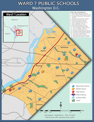
Not having any graphic arts training before, I can assure you there was plenty time spent testing out colors... Before launching ArcMap, I made a list of visual features from most to least important. Ward 7 and schools should be the key highlight of this task. With that in mind, color choices were next as well as deciding what features to exclude. It was clear that Ward 7 should contain the most information. I applied contrast by means of color vibrancy. The area for Ward 7 is the brightest while the colors for the rest of Washington D.C. and surrounding states are dull in comparison. I think the use of a dull pastel green helps visually guide someone to focus on Ward 7 since they’re right next to each other. Establishing figure-ground came through the amount of content in Ward 7, use of contrast, using an outer glow effect for school symbology (on the map), and utilizing a drop shadow effect surrounding Washington D.C. in the main map. All base data and colors were organized in ArcMap first. Then I modified some elements in Illustrator to better establish figure-ground.
Below is the end result of this lab.


Comments
Post a Comment