Module 3- Typography
In this lab we learned some basics in typography and how to apply typographic principles when crafting our maps. The main objective in this exercise was to properly label Marathon, Florida and its surrounding islands.
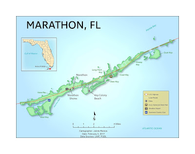
To begin, I created a basic map of Marathon, FL in ArcMap. The only elements added were the inset map of the state of Florida, major roads, Marathon and surrounding islands as the main feature, a north arrow, scale bar, date, cartographer, and data sources. The hard work came in after exporting it to touch it up in Illustrator. All labels, symbols, effects, and legend were done in Illustrator.
At first, it appeared like a simple enough exercise to label a few islands off Florida. But a lot of thought went into how to label all of these items in trying to follow guidelines outlined in the reading. Before starting to label items, I broke down the number of fonts needed, tiers of a site's importance which would determine the font size used, and type colors.
 A few elements I customized:
1. Added inner glow effect to the Marathon keys- I customized the mainland color to include an inner glow effect because I’ve been curious about it. It might be another similar stylization used in National Park maps. However, this effect seemed like a good starting point. It helps bring the land feature definition in addition to the drop shadow effect.
2. Stylized the background using stained glass effect- I was going to leave this layer light blue since the above customization did a good job of bringing up the areas of interest. As I worked on other map elements though, it appeared as if attention might be drawn away from the main feature by colors used in the inset map and legend. So I tested what effect, if any, could improve the background to help bring attention to the main feature. Having gone through many art effects and seeing what they did to the background, the stained glass effect seemed to do the trick. I’m sure there’s likely an easier method of doing this. But what this effect accomplished is to kind of highlight the center of the map making it a lighter blue than the rest.
3. Customized the color for Parks and City Features symbols- Originally, I was going to leave these symbols in their original black and white. But upon further observing the map from afar, there’s a lot of colors and leaving them black and white seemed to unintentionally generalize their category. They’re three unique city features and could use a color swap. The state park symbol is dark brown, the country club a deep blue, and airport black and white.
To begin, I created a basic map of Marathon, FL in ArcMap. The only elements added were the inset map of the state of Florida, major roads, Marathon and surrounding islands as the main feature, a north arrow, scale bar, date, cartographer, and data sources. The hard work came in after exporting it to touch it up in Illustrator. All labels, symbols, effects, and legend were done in Illustrator.
At first, it appeared like a simple enough exercise to label a few islands off Florida. But a lot of thought went into how to label all of these items in trying to follow guidelines outlined in the reading. Before starting to label items, I broke down the number of fonts needed, tiers of a site's importance which would determine the font size used, and type colors.

1. Added inner glow effect to the Marathon keys- I customized the mainland color to include an inner glow effect because I’ve been curious about it. It might be another similar stylization used in National Park maps. However, this effect seemed like a good starting point. It helps bring the land feature definition in addition to the drop shadow effect.
2. Stylized the background using stained glass effect- I was going to leave this layer light blue since the above customization did a good job of bringing up the areas of interest. As I worked on other map elements though, it appeared as if attention might be drawn away from the main feature by colors used in the inset map and legend. So I tested what effect, if any, could improve the background to help bring attention to the main feature. Having gone through many art effects and seeing what they did to the background, the stained glass effect seemed to do the trick. I’m sure there’s likely an easier method of doing this. But what this effect accomplished is to kind of highlight the center of the map making it a lighter blue than the rest.
3. Customized the color for Parks and City Features symbols- Originally, I was going to leave these symbols in their original black and white. But upon further observing the map from afar, there’s a lot of colors and leaving them black and white seemed to unintentionally generalize their category. They’re three unique city features and could use a color swap. The state park symbol is dark brown, the country club a deep blue, and airport black and white.

Comments
Post a Comment