Posts

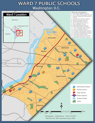
Module 6- Data Classification

Image
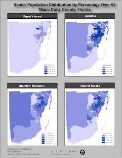
This week we explored different data classification methods and basic procedures to classify data. We were provided with data from the U.S. Census Bureau 2010 Census Tracts for the state of Florida, in Miami Dade County. With this data from the FGDL , we were tasked with classifying it based on percentage of population above 65 years of age and population above 65 years per square mile. For the lab, we had to apply the provided Census data to four different classification methods: Equal Interval, Quantile, Standard Deviation, and Natural Breaks. Below is 1 of 2 maps required for this assignment. This map focuses on displaying the senior population distribution in Miami Dade County, FL by percentage over 65. Each method used 5 classes and data was rounded to two decimal places. Due to color hues playing a significant visual part in this exercise, I decided to remove the borders from each class to better display the distributions.

Module 5- Spatial Statistics

Image
This lab required to complete the Explore Spatial Patterns in Your Data Using ArcGIS  web course via ESRI training. It consists 5 exercises in order to determine which areas in western and central Europe should issue a freeze advisory based on the current readings provided by weather monitoring stations across the region. Ex. 1- Explored the spatial distribution of data: I learned how to calculate the mean center, median center, and examine directional trends of a spatial data set. Ex. 2- Explored the values of the data: this consisted of learning how to interpret data from a Histogram and Normal QQ plot in order to determined that the data set consists of characteristics of normal distribution. Ex. 3- Explored spatial relationships on data: here I used a Voronoi map to identify outlier data points. Ex. 4- Validated spatial autocorrelation using a Semivariogram to determined that there is an outlier in the data set by analyzing the data points in 3d space as means...

Module 4- Cartographic Design

Image
This week we continue our saga in learning and applying key cartographic design principles. Last week was a crash course in typography, so this week we focused on map design. The task at hand was to create a map of public schools in Ward 7, Washington D.C. while complying with Gestalt's Principles of Visual Hierarchy, Contrast, Figure-ground, and Balance. Not having any graphic arts training before, I can assure you there was plenty time spent testing out colors... Before launching ArcMap, I made a list of visual features from most to least important. Ward 7 and schools should be the key highlight of this task. With that in mind, color choices were next as well as deciding what features to exclude. It was clear that Ward 7 should contain the most information. I applied contrast by means of color vibrancy. The area for Ward 7 is the brightest while the colors for the rest of Washington D.C. and surrounding states are dull in comparison. I think the use of a dull pastel green helps...

Module 3- Typography

Image
In this lab we learned some basics in typography and how to apply typographic principles when crafting our maps. The main objective in this exercise was to properly label Marathon, Florida and its surrounding islands. To begin, I created a basic map of Marathon, FL in ArcMap. The only elements added were the inset map of the state of Florida, major roads, Marathon and surrounding islands as the main feature, a north arrow, scale bar, date, cartographer, and data sources. The hard work came in after exporting it to touch it up in Illustrator. All labels, symbols, effects, and legend were done in Illustrator. At first, it appeared like a simple enough exercise to label a few islands off Florida. But a lot of thought went into how to label all of these items in trying to follow guidelines outlined in the reading. Before starting to label items, I broke down the number of fonts needed, tiers of a site's importance which would determine the font size used, and type colors. A few ...

Module 2- Introduction to Adobe Illustrator

Image
This week we explored utilizing both ArcMap and Adobe Illustrator to create and enhance a basic map of Florida for a children's encyclopedia. I wound up spending a lot more time on this assignment than expected since it was my first time enhancing a map from ArcMap. Layers needed some readjusting before I felt comfortable adding graphics. Color scheme wise, I decided to keep it light and simple, it's for kids after all. That dictated the choice of font and border style used as well as the title. There were a lot of images in this map that could drown out the title. So I figured it was best to make a banner for it to stand out. This is actually the second map because while working through the lab document the first time, I realized that my initial Florida map layout did not suit the layout I worked towards in AI. When I was ready to work on a finalized version, knowing the audience and content required drove the layout.

Module 1- Map Evaluation & Critique

Image
In this introductory cartography lab, we reviewed some basic aesthetics of what makes a good map and common map design principles. The exercise at hand required that we select two maps of our choice, one which we think is well designed and one poorly designed. Evaluation of a poorly designed map: This selection had to serve as example of nearly everything to avoid when creating a decent informative map. As more of a visual learner, busy displays can be very disruptive and intimidating. I've seen language and dialect maps before and they can very aesthetically pleasing to the eye and inviting to process their information. I would give this map a D letter grade for effort and information alone. My main reasons for a low grade are highly due to the lack to effectively label the map, the general layout is more complex than it needed to be, and it fails to be graphically pleasing. Three areas of improvement I would suggest working on are: layout, labels, and color theme. The t...

Cartographic Skills- Introduction

Hi! My name is Julieta Ramos and I’m from Los Angeles, California. I hold a B.A. in Anthropology from the University of California Riverside. During undergrad years, I completed an archaeology field school in Belize, and interned for LULAC in Washington D.C.. Afterwards, I volunteered for the World Wide Organization of Organic Farmers (WWOOF) for 3 months in France and Italy. From there, I worked in CRM and tutored for a few years before falling backwards into the game industry in which I’ve worked my way up from a tester to project and localization manager for a video game studio in town. Having worked in software development for the past 6 years helped steer me back to this field since it continues to play a major role in geographical intelligence and advancements. Earth is ever changing and I see this industry growing fast. I figured this is the right time in my life to invest in a dream career path. Upon discovering GIS during undergrad, I've kept meaning to return to work in...

Week 13-16- Final Project

Image
Purpose:  This final assignment placed us in the position of a real GIS analyst for the energy company Florida Power and Light (FPL). The task being to analyze key components that had been considered in gaining right-of-way acquisition for the approved Bobwhite-Manatee Transmission Line Project-- a real life project. We are to choose the best route which is both economically and minimally invasive to the environment and communities in Manatee and Sarasota counties using a more generalized and scaled-down version of the original project survey done in 2009. ... Easy, right? It was really helpful to have started this assignment by creating a Cartographic Model and working from there to best organize the data needed each step. Every step required to go back and reference previous lessons from this course. It was as much a challenge as a refresher. Below is 1 of 5 maps done for this final project. Along with the main project analysis, we had to assemble a powerpoint presen...

Week 12- Georeferencing

Image
Purpose: To become familiar with Georeferencing, Georeference data using the Control Points tool, Georeference an unknown raster image of the campus to known vector data, interpret Residual and Root Mean Square errors, digitize new building and road features, practice polynomial transformations, create hyperlinks in ArcGIS to stored data, create Multiple Ring Buffers, customize an ArcMap toolbar, overlay data in a 3D environment. Overall, this was a fairly light lab, but very time consuming in trying to adjust the aerials just right so the image is as straight as possible. The goal here was to georeference two raster images of the UWF campus and have less than 15 RMS error, which I did. In addition to this, we had to create a multi ring buffer (MRB) surroind nearby eagles nests. The second portion of this map deliverable included a 3D map done in ArcScene of the aerials we georeferenced previously.

Week 11- Geocoding

Image
Purpose:  Create an address locator, conduct geocoding via address matching, conduct a route analysis using the Network Analyst extension, and analyze data in a model using ModelBuilder. It may not sound like much, but this lab was heavy in content to communicate. I have been curious about how professionals apply GIS to day to day utilities and managed to get a brief glimpse of what's involved. It also served to comprehend just how critical it is for the GIS technician or cartographer to provide the most accurate and up to date data possible. For this main exercise, we had to geocode 21 Emegency Medical Services locations within Lake County, Florida. Some sites had no matching addresses which had to be researched using the LakeEMS.org site and Bing maps in order to place them on the map correctly. In addition to mapping EMS locations, we had to select 3 random sites and find the most optimal route. The map below shows my results. \ The second part of this lab required to...

Week 9 &10 Labs- Vectors!

Image
ArcPy is the best!... Let's backtrack a bit to review material covered the past two weeks. During week 9, we went through sorting, specified Selections, and Joins in ArcMap using different types of shape files. I'll be repeating the exercise using different scenarios and conditions to make sure I attain a solid understanding of those tools before our final project. Not to mention that it feels like I will be utilizing those tools on a regular basis in the future. Week 10 we continue our lesson in Vectors by going over Buffers,  Overlay types, and Data Management tools in ArcToolbox. We also reviews some basics of how to use ArcPy. Granted the lab only covered a simple, yet handy, reason to use it by creating new layers with modified buffer settings. But I'm looking forward to playing with it in the near future. Below is the result of this week's lab which demanded to isolate possible campsites in the De Soto National Forest in Mississippi that were 300m from roads, 15...

Week 7&8 Lab- Data Search

Image
Purpose:  Perform our own data search consisting of 5 Vectors, 2 Rasters, and 2 Environmental data files of our choice. Final outcome should be 2-3 map layouts showing all 9 data layers. This is our midterm assignment! I was feeling a bit more confident by the end of last week's lab exercise and became humbled after digging into this lab. Plenty of time was spent gathering data and organizing it in the source folder. I did my best to select the appropriate data from the FGDL site. For the 2 Environmental Layers I chose Land Cover and Invasive Plants because they seemed like a good pairing of data and could potentially be affecting each other. Before opening ArcMap, I also grabbed the necessary DOQQ and DEM files for Indian River County from the LABINS  and USGS National Map sites. Starting with the County boundary map shape file, I decided on the  NAD_1983_2011_StatePlane_Florida_East_FIPS_0901_Ft_US  coordinate system to reproject all my data to. From the bo...

Week 6 Lab- Projections Pt. 2

Image
Purpose:  Learn how to find spatial data, define spatial references for that data and applying a projection to it. This lab started with conducting a data search to map eagle nest locations in Cantonment, FL, located in Escambia County, using the State Plane projected coordinate system. It was required to projected vector files from Albers to State Plane projection and learn how to verify new vector files are using the desired coordinate system. The last portion of the practice exercise required creating Tabular data in Microsoft Excel and making a shape file from it in ArcMap. The data sample for this was small in order to comprehend how coordinate data worked at its core in an excel sheet. The second part of this lab demanded to repeat most of the sample exercise steps in order to map Petroleum Tank Contamination sites in Escambia County. Using the quadindex.pdf as a guide to quads in Escambia County, I went with Perdido Bay, which falls on Quadrant #5160. While working on...

Week 5 Lab- Projections Pt. 1

Image
Purpose: To view and project data into three different projected coordinate systems in ArcMap. Then quantify the difference in area between data displayed in the three projected coordinate systems  and map them in multiple data frames. The big task this week was comprehending how Projected Coordinate Systems work, why they're important, and how they apply to a map you create. To lay this out, we worked with a single shape file for the state of Florida and modified the coordinate system using ArcToolbox. In order to view the differences in Projected Coordinate Systems, a number of counties had to be selected and highlighted in the maps using Attribute Tables for each layer. Then the area of the four counties was calculated and recorded on a table to include in the map below.

Week 4 Lab- Sharing GIS

Image
Purpose of lab: Create a "Top 10" list, map the data compiled from scratch, then share content via ArcGIS Online, and Google Earth. For starters, usually we only need access for MS Word and ArcMap. The following items were necessary for this particular lab.: ArcMap Excel (or Google Spreadsheets) MS Word arcgis.com account Google Earth I enjoy going on hiking adventures from time to time with loved ones and have been fortunate enough to visit a decent number of locations in my home state. California is huge though, I'm sure there's plenty I have not heard of yet. With that in mind,   I decided to go with top hiking spots in California using information off  exploretheusa.com  f or my "Top 10" list. Residents can be very territorial here when expressing benefits of particular regions. So I tried to select a list that seemed balanced and included locations throughout the state. Next we gathered specific data about these 10 locations: Rank, Name,...

Week 3 Lab- GIS & Cartography

Image
Purpose of lab:   Learn how to utilize ArcCatalog, continue exploring data layouts and symbology options, exporting data, customize raster files, how to create maps, manipulate cartographic data, how to organize manage multiple data frames, and manipulate legend information. There was a wealth of information to process and continue to absorb this week. Without having experienced many other GIS fields of practice yet, I do have a keen interest in Cartography and want the challenge of learning if it's for me. We had the opportunity to utilize ArcCatalog and see how it is linked to ArcMap for map making. I loved the pin feature in ArcMap! It's very handy being able to simply drag and drop data files onto a blank map file from ArcCatalog once you've organized data files. Below I will further recount my experiences while creating three different maps of Mexico. Map 1: States of Mexico by Population This map exercise allowed to practice layer management in the To...

Week 2 Lab- Own Your Map!

Image
This week’s lab allowed us to go a bit deeper in customizing a map in ArcMap. Last week we had the opportunity to explore feature placement and get a feel for prioritizing the information needed. This exercise was a challenge in that it introduced how to add an inset map while still communicating where it fits in a regional map, or part of it. The more thought I put into how it could be read by a random person, the more complex something such as color selection became. ...Not that I was stuck here for two hours. But it was something new I learned while going through the steps. This was important. More important though was focusing on the goal of this map, which was to direct someone to the UWF campus on a general map of Escambia County in Florida. I found the steps in customizing land features, such as roads and rivers, very useful. To be honest, I had not put that much weight into selecting a clear color choice for these before. But they’re equally significant to stand out against t...

Week 1 Lab- ArcGIS Overview

Image
 I've had the opportunity to work with ArcGIS software before, but not in a remote environment setting. Fortunately everything seems to run smoothly! The purpose of this week's lab is to create our first map. We were given two data sets to add to a blank document in ArcMap: Cities and one for World Countries. I found this to be a really good introduction, or re-introduction for some, exercise to ArcGIS software. The lab document seemed intimidating at first, but with good reason. It did a great job in mentioning alternative ways to find certain tools or do things. It's very helpful. What I probably enjoyed most was going through metadata and looking over how the information within an attribute table affects the outcome. This exercise also presented a good opportunity in visual customization of one's map through a layer's Properties. The map's focus is to show Countries by Population. I decided to go with light blue for background, so as to not leave so much em...