Posts

GIS4035 Module 8-- Thermal Imagery
Image
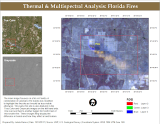
In our lab this week we delved more into Multispectral Analysis involving Thermal Imagery in order to learn how to interpret radiant energy. Using both ArcMap and ERDAS Imagine, I was able to create two different composite multispectral satellite images from TIFF files. For the final map assignment, I used the composite image created in Exercise 2 of this lab which I compiled in ERDAS Imagine. I had already identified a big fire site and then happened to find another one further down the image. As means to highlight the fire I modified the RGB bands to R-2, G-3, B-5 in the Landsat 4 TM satellite image. This made surrounding vegetation a dull blue while making the fire and its smoke orange.

GIS5935 Week 8-- Surface Interpolation

Image
Interpolation is utilized in order to give a raster cell a predicted number value. We use interpolation methods to create a value for unknown values basically. This is necessary for a number of different data gathering issues such as difficult environments or complex point data that could otherwise prove difficult to measure in person. We had the opportunity to examine and perform many types of spatial interpolations in this lab such as: Thiessen Inverse Distance Weighted Spline Working with a Water Quality point data set for Tampa Bay, we were required to perform surface interpolations to examine the distribution of Biochemical Oxygen Demand (BOD) in milligrams per liter. Below is the result for Thiessen. The darker polygons represent a lower BOD concentration, while white polygons represent a high concentration. This example represents Inverse Distance Weighted interpolation. The ranges here vary from light pink, high BOD concentration, to dark green, lower B...

GIS4035 Module 7-- Multispectral Analysis

Image
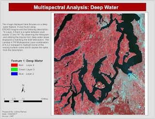
We continued our lessons in ERDAS Imagine this week through lab exercises which taught us how to interpret histogram data of satellite images and how to identify features using said data. By the end, I had to have identified three different features that fit the following descriptions: In Layer_4 there is a spike between pixel values of 12 and 18.  Identify the feature that represents both A) a small spike in layers 1-4 around pixel value 200, and B) a large spike between pixel values 9 and 11 in Layer_5 and Layer_6.  In certain areas of water, layers 1-3 to become much brighter than normal, layer 4 becomes somewhat brighter, and layers 5-6 to remain unchanged. I used the Inquire cursor for the first feature as it points to pixel values. Having analyzed the histogram, it helped determine that the feature I'm looking for would be dark in color. The only consistently dark feature was deep water. There were two areas in the image with the brightest pixels but...

GIS5935 Week 7-- TINs and DEMs

Image
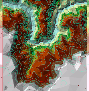
This week we explored Triangular Irregular Networks (TIN) and Digital Elevation Models (DEM) in greater detail to learn their differences, the type of applications they're typically used in, and what makes each unique when applied in a GIS analysis. I found the lab exercises to be extremely helpful in illustrating differences. For example, when you add points to represent data points to a DEM, there will be more points as opposed to a TIN which creates a point where necessary in order to highlight the most relevant data. Above is an example from an exercise which I think serves to gather a better idea of how data in TINs is distributed. The aqua contours represent contours created from a Spline done on a set of Points. Black and red contours represent TIN contours. A big difference I noticed right away was how spaced the contours created from points were in comparison to the contours from the TIN. The biggest differences appeared to be at lower elevations where the point c...

GIS4035 Module 6-- Image Processing 1: Spatial Enhancement and Radiometric Correction

Image
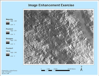
In this week's lab, we had the opportunity to enhance a satellite image using ERDAS Imagine and ArcMap. The initial image we worked with in ERDAS had a lot of strip down the entire image... it was intimidating. Then I was able to reduce the stripping by applying a blocker to bright spots via a Fourier image. I learned that this effect helps the stripes blend in. Out of curiosity, I applied a second Fourier image this time without a LowPass effect and found that it greatly improved the clarity of my image. A second enhancement was done in ArcMap using the Focal Statistics tool which performs statistical tests using adjustable kernel of many shapes and sizes, and also calculates individual values for every cell. In the provided exercise, I tested Mean and Range values. In my final image I applied a Statistic Type Majority with 7Hx7W. The most image enhancing I've done in the past has been in Photoshop. Learning these new image enhancing processes for larger images was very ...

GIS5935 Week 6-- Networks: Location Allocation

Image
This week we focused on Location-Allocation modeling. This type of modeling is extremely useful in Vehicle Routing Problem (VRP) scenarios and determining the best solutions of distribution for specific areas or market targets. The lab consisted of two parts again. The first being a tutorial portion based on exercises from ESRI's ArcGIS Desktop page. The second required to perform a VRP analysis using Location-Allocation in order to adjust the assignment of market areas serviced by distribution centers throughout the U.S.

GIS5935 Week 5-- Networks: Vehicle Routing

Image
This week we focused on Vehicle Routing Problem (VRP), how they function and the many factors and parameters associated with its classes. I did not realize how much we utilize this extremely complex system of networks in our day to day lives. If you've ever used any form of transport, you've participated in a VRP. To begin, we were tasked with going through two exercises from the ArcGIS Desktop site. I added orders and depots to the VRP then running the Solve button to determine the best route assignment. After wards I had to make changes to the existing solution to resolve a different scenario, which required: to delete a route, adding route renewals, breaks, and overtime. Then once again Solve the route to determine the solution. In the second exercise, we needed to find the best routes to service paid orders using three routes for certain areas. This was fairly similar to the first practice exercise, but required for me to add pairs, specialties, create route zones, and ...

GIS4035 Module 5a-- Intro to Electromagnetic Radiation

Image
I really enjoyed this week's lecture and lab since we got the opportunity to delve deeper into how Electromagnetic Radiation (EMR) works, a topic we merely brushed on back in High School Physics. For the lab, first we had to calculate EMR properties by reviewing Maxwel's Wave Theory and Planck's Relation formulas and working through sample problems. Using ERDAS Imagine, we were tasked with modifying large scale satellite images (AVHRR and Landsat TM) as part of learning how to use basic tools, set image settings, and navigate throughout the Viewer. One of the tools learned during this lab were the Inquire tools. I used the Inquire Box in order to place and box over a classified image of forest lands in Washington State in order to create a subset image. I also added a new column for Area in its attribute table. So once the image was processed, a new .img file was created and it consisted of land cover names (Water, Cloud, Bare Ground, etc.) and their area in unit...

GIS5935 Week 4-- Networks: Network Analysis

Image
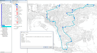
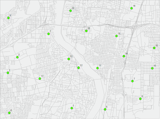
This week in Special Topics in GIS was our first week looking at Networks, we focused on Network Analysis specifically. There were two parts to the lab, the first was a set of introductory exercises to help us refresh on how to create a Network using ArcMap's Network Analyst extension tools as well as review the elements that make up a functioning Network. For the second part of the lab we modified data for provided Network. First I created a new Network Dataset with Turn Restrictions by adding RestrictedTurns and Streets feature classes to the data frame. A point shape file of Facility locations was used for Stops. There were a total of 19 Stops that resulted in a total time of 105.5 Minutes (1.76 hrs). For the final portion of the lab, I created  a second Network Dataset which included a Traffic Model. The Traffic model is enabled in the Network setup wizard and allows your network to use historic traffic data for an analysis. The map below displays the new route and...

GIS4035 Module 4-- Ground Truthing and Accuracy Assessment

Image
This week, we revisited our aerial LULC Classification analysis of Pascagoula, Mississippi in order to determine accuracy using ground truthing methods. I created a random sample pattern of points in a new shape file and placed them throughout my previous LULC Classification map layout. Then performed a ground truthing assessment of land features using Google Street Map view online. Accuracy percentages resulted in 57% accurate points and 43% false points. Looking back, I believe I could have done better in my initial assessment of features in the aerial photograph.

GIS5935 Week 3-- Data Quality : Assessment

Image
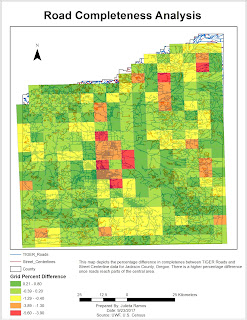
In this assignment, we learned how to determine the quality of road networks by determining their completeness by comparing total lengths of two different road data sets. Using Calculate Geometry, in kilometers, I was able to determine that TIGER roads were more complete by comparison. Total TIGER Roads length came out to be 11,383 km, while Street Centerlines were 10,805.8 km. I actually had a more difficult time organizing this analysis than initially expected. The method that seemed to work was to first clip the two roads to the grid shape file. From there run the Intersect tool on both road clips to the grid, separately of course. Then gathered the length info from each road DBF files and added it to a new excel sheet to included GRIDCODE, FID, and Lengths. In this new sheet, I then calculated the percentages using the provided formula of: % difference = (total length centerlines – total length TIGER) / total length centerlines * 100% Then I added this sheet to the TOC ...

GIS4035 Module 3-- Land Use Land Cover Classification

Image
There was a lot of content to digest this week in Photo Interpretation and Remote Sensing. We delved into what Land Use and Land Cover actually represent, and Land Use Land Cover (LULC) classifications, reasons, definitions, and its process. It was very interesting learning about this system's process, the technology required for recording data, and how the recording of data for each type of main feature differed from one another. I hold a personal interest in this field, so it was a fascinating read. The lab required to create a land use/land cover map from a provided aerial photograph by applying recognition elements to LULC classification and be able to identify various different features. I was able to identify 12 unique features. Unfortunately, I ran out of time and did not get to identify all of the features in the aerial photograph.

GIS5935 Week 2-- Data Quality: Standards

Image
For this second week into standards in regards to Data Quality, we had to perform a horizontal accuracy assessment using NSSDA protocol methodology in order to determine the accuracy of two different street map data sets based off the same area in Albuquerque, New Mexico. Using two different street sample data sets: City data (ABQ_Streets) and ESRI street map data (StreetMapUSA). I started things off by creating a network data set for each street shape file in ArcMap. Next, in order to be mindful of the study area and attempt to make sure the points met the criteria, I created a fishnet with 2x2 columns/rows which creates 4 quadrants within the study area. Working off the Junction layer for ABQ_Streets, I selected 20 intersection test points as suggested. It was encouraged to use the City data set due to it being more accurate. Then comparing the selected test points, I selected matching test points for the StreetMapUSA data set. The third and final data set needed for this lab w...

GIS4035 Module 2-- Aerial Photography Basics & Visual Interpretation of Aerial Photography

Image
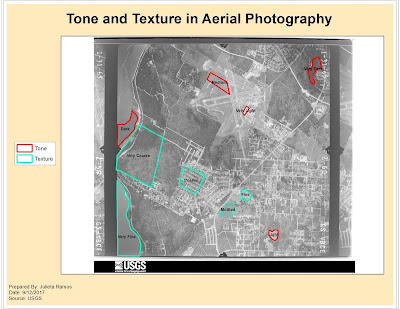
For this module's lab, we observed three different aerial images for three different purposes: first served to identify tone and textures, second was identifying physical features, and third was interpreting color. Only two maps were required for the first two exercises. The objective for exercise 1 was to be able to identify texture and tone in an aerial photograph. For both elements, it was required to observe at least 5 different tones and textures (i.e. light, very light, dark, coarse, etc.). The objective for exercise 2 was to learn how to identify features according to shape and size, shadows, pattern, and by association. I think I did a good job after zooming in and examining the aerial image closer to try and identify features better. Shadows became very helpful in singling out possible trees or street posts which then helped with associating other features nearby.

GIS5935 Week 1-- Data Quality: Fundamentals

Image
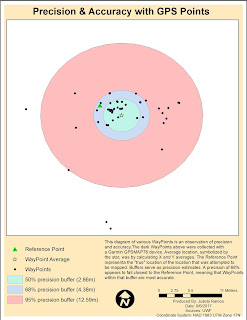
For our first lab in Special Topics in GIS we looked at what accuracy and error mean in the context of Data Quality. In this first part of the lab I calculated the average WayPoint based off WayPoints gathered from a Garmin GPSMAP76 unit in order to find the precision of a specific location. Average location was determined by calculating X and Y averages. In the diagram below, the Reference Point represents a the "true" location of the location that was attempted to be mapped. Buffers of 50%, 68% and 95% precision were also calculated to observe the precision of the data. For the second part of the lab, we had to calculate error metrics for another and larger set of GPS points and create a Cumulative Distribution Function graph showing the error distribution for all metrics.

Orientation Assignment - Own Your Map

Image
As part of Orientation week for this course we reviewed some basics from the Introduction to GIS course. We were given a template map of Florida counties. We had to create a map for the UWF campus in Escambia County using data provided by FGDL which included: Escambia County, major roads, and rivers. Roads and rivers were clipped to fit the county shape. The font titles, County map colors, data frame background colors and frames, symbols for the UWF campus, Interstate, and River were all customized. I have not had to create a map in ArcMap recently, so this was a nice refreshing exercise to get back in practice.

Module11- Sharing Tools

Image
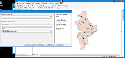
This module served very much as a review in Script Tools. The assignment required that we edit an existing script to work with data provided, edit parameter details for the tool to become more user friendly, then finalize it by embedding the script into the tool and creating a password for it.  This is the final outcome of tool. It was supposed to create randomized points with buffers within the feature boundary.  Below is a flowchart displaying basic steps taken to create and share this Script Tool. ...and that's a wrap! This was the last module for GIS Programming course. I still have the final project to complete for next week. While it's not the end yet, there is a sense of accomplishment in having made it this far in a course I thought I would perform terribly in. All modules focused on Python fundamentals were very challenging for me but also the most rewarding once I figured things out. It was really helpful being familiar with how certain tools wo...

Module 10- Creating Custom Tools

Image
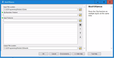
This week we reviewed some Script Tool fundamentals. The lab required that we modify a stand alone script to perform a multi clipping task in ArcMap. First, I tested the script in PythonWin to make sure it worked. Then created a new Toolbox in ArcMap, added a new Script Tool, and linked the stand alone script here in order to use it. Next was modifications to the Script Tool parameters and script to make it work in ArcMap. Below is an image of the opened Script Tool displaying both input and output locations, meaning that the new parameters were working as expected. After making some code adjustments to the script and editing variable values to point to the desired parameters for Output Boundary Feature and Input Features. The tool dialog box below displays a successful task completed listing all the shape files being clipped in the process. There are definitely more steps in the process of creating a new custom tool for ArcMap while the script may be simpler. Bel...

Peer Review Assignment #2

This peer review takes a look at A new GIS-based model for automated extraction of Sand Dune encroachment case study: Dakhla Oases, western desert of Egypt found in the UWF Journal's resources database. Sand dunes are considered a threat for roads, water sources, agriculture, irrigation networks, and infrastructures in the Dakhla Oases in the western desert region of Egypt. The focus of this paper is to develop a new GIS based model for automated extraction of sand dune encroachment using remote sensing data to assess the rate of sand dune movement. The paper is a group effort amongst staff from the Department of Remote Sensing and Landscape Information Systems (FeLis) at Freiburg University, Germany, and the Land Use Department at the National Authority for Remote Sensing and Space Sciences (NARSS) in Cairo, Egypt. This particular case study was published in Volume 15, Issue 1 of The Egyptian Journal of Remote Sensing and Space Science in June 2012. The data provided for this c...

Module 9- Working with Rasters

Image
Last week we focused on vectors, this week we looked at working with rasters in Python. This lab assignment required to write a script that does the following tasks: creates a raster output file that identifies areas with specific parameters (slope, aspect, and land cover type). The flowchart to the right displays simplified steps taken in the script. Using two rasters, for landcover and elevation, the final raster highlights areas that suit the following criteria: Forest landcover consists of classifications 41, 42, and 43 Slope falls between 5-20° Aspect ranges between 150-270° Below is the script output: and the final raster image: